“Chance Me”
“Chance Me” (Documentation)
1. The Spark
I stand in the corridor of calculations,
My spine a row of digits pinned to a silent wall.
The initial inspiration stems from a profound anxiety about being “dimensionalized.” I’m constantly cut into pieces by scores, rankings, metrics, and charts, as if every aspect of life must be quantified by external data. Especially during college application season, as I repeatedly scrolled through “Chance Me” posts and content on the A2C subreddit (Applying to College), I felt myself reduced to a sequence of parameters. SAT scores, GPA, activity lists, percentile ranks—these data points scattered across my digital file, while I gradually lost sight of the emotions and self that lie behind those numbers.

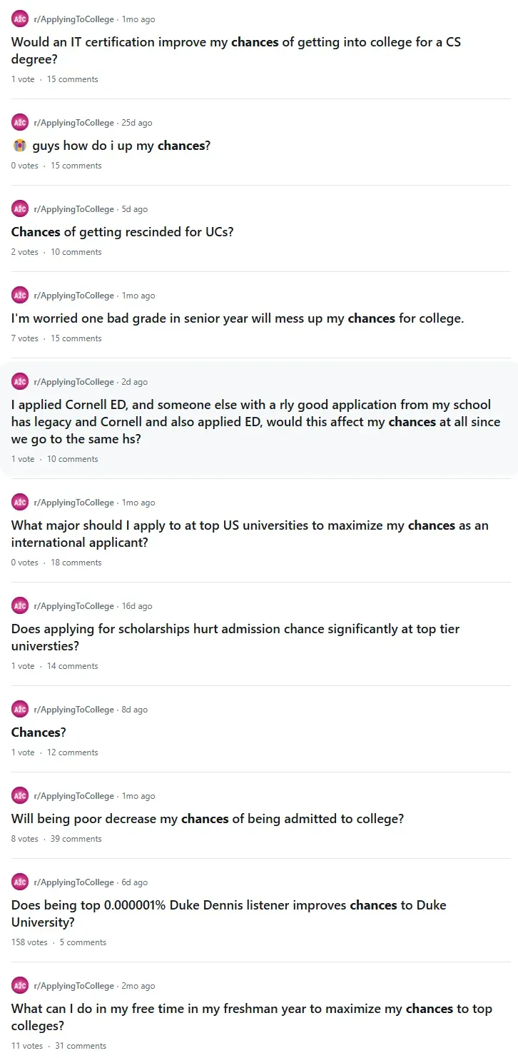
During application season, I was basically addicted to browsing A2C, irresponsibly ensuring I never missed a single hot post. Every morning, the first thing I did was check my Gmail, which was stuffed with spammy emails from various schools and institutions, hoping to see any new updates. The second thing was to open A2C. In Shanghai, I spent about 40 minutes commuting each day, and almost all those 40 minutes were devoted to checking A2C. I couldn’t see myself anymore; I could only rely on this system to continually triangulate my position. In truth, I felt the cold, indifferent gaze of data. Those line charts, distributions, and color blocks flashed on the screen, seemingly concerned only with “productivity” and “efficiency,” ignoring the complexity of me as a human being. This austere “data visualization” made me wonder: In the education and self-evaluation systems, how exactly are we shaped by scores and algorithms?
I want this work to speak to those who find themselves wandering through this process. I hope to connect with people trapped between the need for external validation and the loss of an internal voice. When they stand before a camera and sense the artwork detecting and scoring their posture, will they recognize the absurdity of it? Perhaps this predicament isn’t mine alone. It could be a collective metaphor for our era.
2. The Concept
Key themes: Self, Evaluation, Scores, Algorithms, Absurdity, Technology & Humanity.
I considered “Dimensionalized” or “Chance Me” as a title. The former highlights the sense of infinite fragmentation into dimensions, while the latter resonates with the self-quantification requests on college application forums. Ultimately, I lean towards “Chance Me” because it aligns better with the chosen style and is more direct.
The core question of the piece: When every evaluation is translated into scores and parameters, does our self still exist beyond those numbers? When viewers approach the camera and see the system assigning them an unstable, flickering score, I hope they feel a mix of humor and discomfort. They might ask themselves: Why are we so fixated on using numbers and algorithms to measure human worth?
3. The Craft
My form collapses into a grid,
Coordinates and confidence scores replacing skin and bone.
Rationale for Technical Choices:
- Using a webcam and pose detection was intended so that as soon as the viewer’s body enters the artwork’s field of view, it is immediately captured and judged. This represents yet another form of “dimensionalizing” people. Through the ml5.js BodyPose model, the human figure is broken down into a set of coordinates and confidence values, enabling the piece to “infer” an absurd score from the viewer’s posture.
- The flickering score is meant to convey instability and absurdity. The numbers flash and change randomly, constantly reminding viewers of the inherent ridiculousness of this rating process.
Implementation Details:
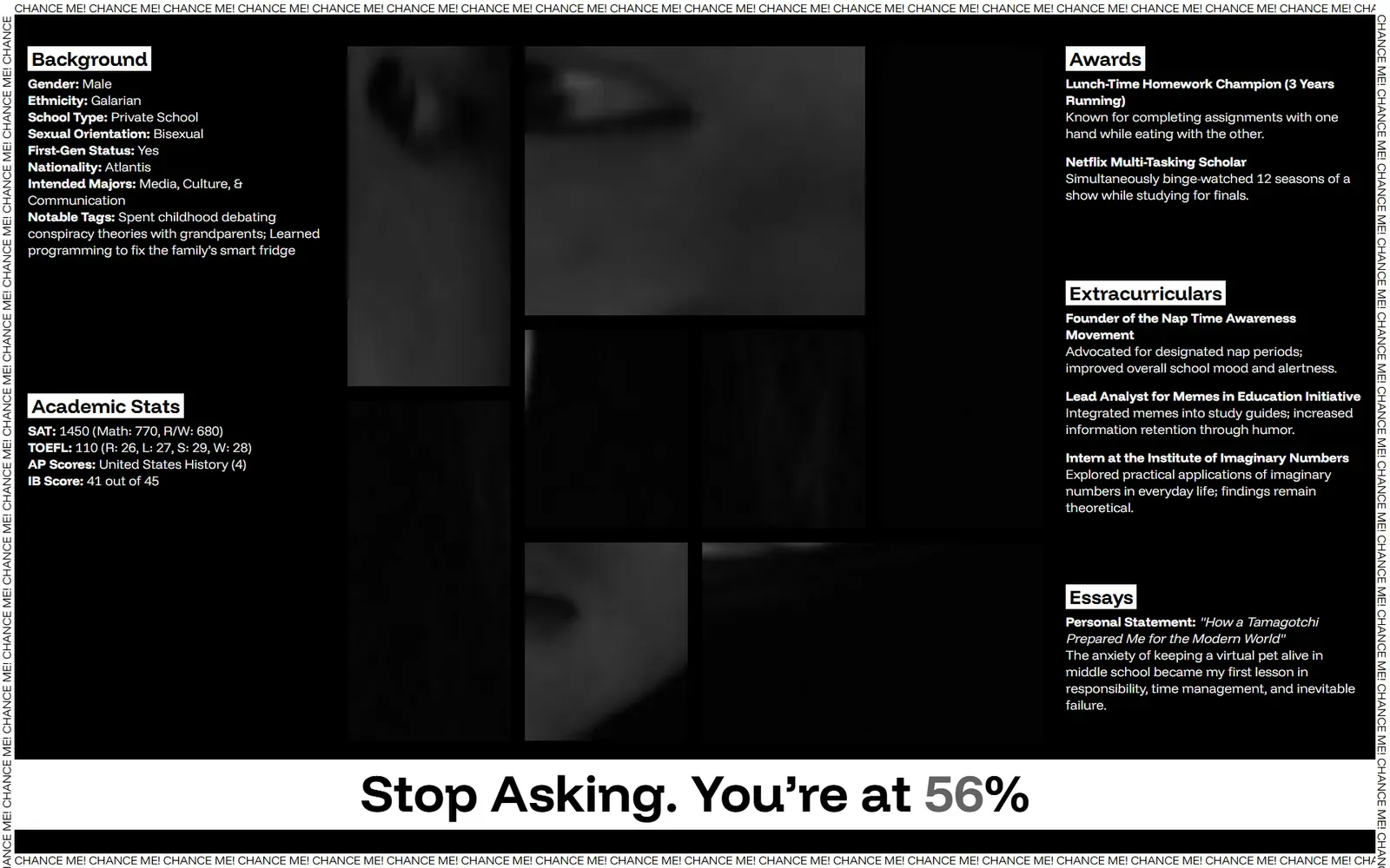
- Technology Stack: A front-end setup with HTML/CSS/JS, using ml5.js for pose detection. The layout employs a bento-grid pattern with CSS Grid, arranging information-dense modules side by side.
- Challenges: Pose detection accuracy poses a key difficulty. Thresholding and smoothing may be required to avoid jittery keypoints that disrupt the viewing experience. Moreover, ensuring stable performance across different devices and network conditions is crucial. The flickering effect is achieved by periodically updating numbers with JavaScript and controlling the blinking tempo via CSS transitions.
Significance:
- By leveraging pose detection, the technology itself becomes part of the artwork’s metaphor. The viewer’s posture is transformed into numerical data, automatically parsed by an algorithm and then represented as a score—a direct reflection of the idea of being “dimensionalized.”
- This interactive element naturally integrates into the artistic narrative: as viewers watch the screen and try to decipher the constantly shifting numbers, they themselves become part of the piece, also being “quantified” by it. The resulting discomfort and sense of being surveilled effectively convey the satire of being evaluated by algorithms.
3.1. Source code is available here
https://github.com/n3xta/fall2024-creative-computing-final
Coding is fun:
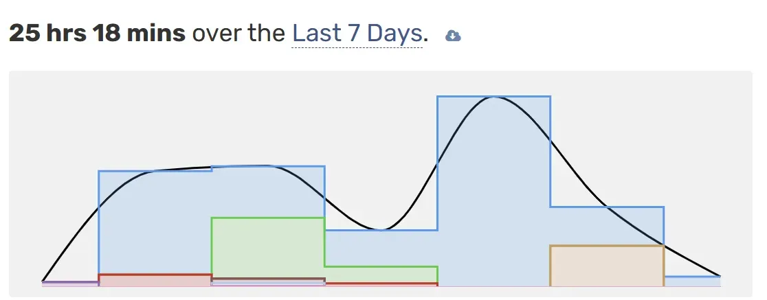
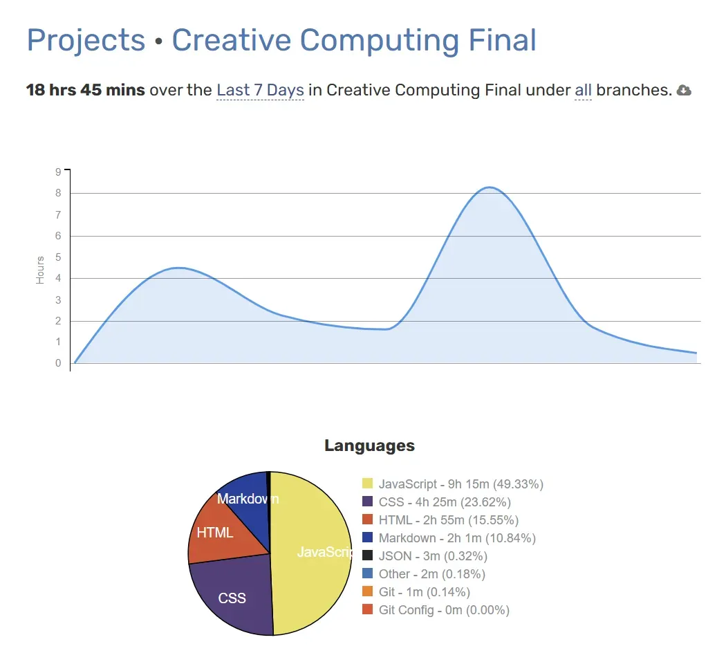
3.2. Code Walkthrough
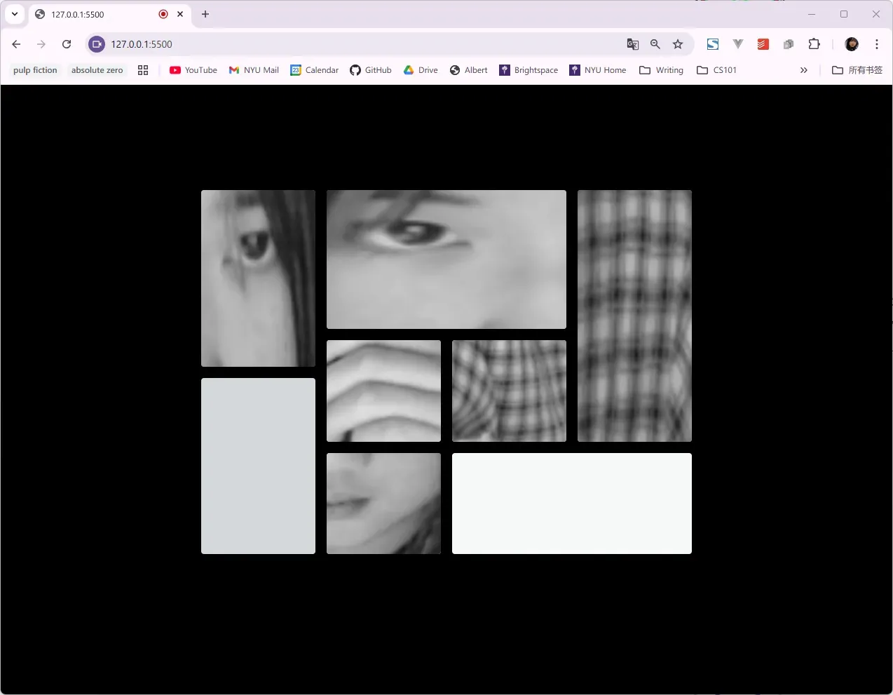
My code sets up a webpage that captures user video input, detects body keypoints (like the right eye or left shoulder) using ml5.js (which is built atop TensorFlow.js), and then dynamically generates and displays a “report” with fictional demographic and academic data. The layout uses a bento-grid pattern to show cropped sections of the video feed that correspond to specific body parts.
Over time, as the user appears in front of the camera and certain conditions are met (like the right eye being detected), the script generates a random profile and “chance percentage.” The styling is intentionally minimalist (black and white) to maintain an unsettling, data-driven atmosphere while the textual content—awards, extracurriculars, ethnicities, etc.—is all fictional and absurd, emphasizing the arbitrary nature of such “dimensionalized” evaluation.
3.2.1. HTML Walkthrough
Key Points:
-
Use of
<script>tags loading external libraries:p5.js,p5.sound.js,ml5.jsfor machine learning, andd3.jsfor data manipulation.<script src="https://cdnjs.cloudflare.com/ajax/libs/p5.js/1.11.1/p5.js"></script> <script src="https://unpkg.com/ml5@1/dist/ml5.js"></script> <script src="https://cdn.jsdelivr.net/npm/d3@7"></script> -
Custom fonts are loaded, including
'Funnel Display'from a remote URL and'Courier Prime'from Google Fonts. The chosen fonts, often monospaced or minimalist, enhance the “technical dossier” vibe.<link href="https://fonts.googleapis.com/css2?family=Courier+Prime:ital,wght@0,400;0,700;1,400;1,700&display=swap" rel="stylesheet"> @font-face { font-family: 'Funnel Display'; src: url('...FunnelDisplay-VariableFont_wght.ttf') format('truetype'); } -
The
mainsection houses three primary areas:#report1on the left- The
.bento-grid-wrapper(with.bento-grid) in the middle #report2on the right
Below them is the#chancessection, displaying a dynamic percentage.
<main> <div id="report1"> <div id="background"></div> <div id="academic-stats"></div> </div> <div class="bento-grid-wrapper"> <div class="bento-grid"> <!-- Multiple <canvas> elements to draw cropped video parts --> <div class="container"><canvas id="1"></canvas></div> ... <div class="container"><canvas id="8"></canvas></div> </div> </div> <div id="report2"> <div id="awards"></div> <div id="extracurriculars"></div> <div id="essays"></div> </div> <div id="chances"> <h2>Stop Asking. You’re at <span id="chance-percentage">--%</span>%</h2> </div> </main> -
The “border” area uses scrolling text in fixed positions around the edges:
<border> <div class="scrolling-text top"><div class="text">CHANCE ME! </div></div> <div class="scrolling-text bottom"><div class="text">CHANCE ME! </div></div> <div class="scrolling-text left"><div class="text">CHANCE ME! </div></div> <div class="scrolling-text right"><div class="text">CHANCE ME! </div></div> </border> -
Scripts
gsap.min.jsandTextPlugin.min.jsare included at the end for smooth text animations.
3.2.2. CSS Highlights
-
Reset and box-sizing: my code sets
* { box-sizing: border-box; }and removes margins and paddings from all elements for a clean slate. -
Black-and-white style:
The background is black, text is mostly white or grayscale. This aesthetic helps emphasize the data-driven, disconcerting environment.body { background-color: black; color: #333; /* Foreground text colors vary but are muted */ } -
Layout:
A CSS Grid layout definesmainwith 3 columns and a row for the “chances” section:main { display: grid; grid-template-areas: 'left middle right' 'chances chances chances'; } -
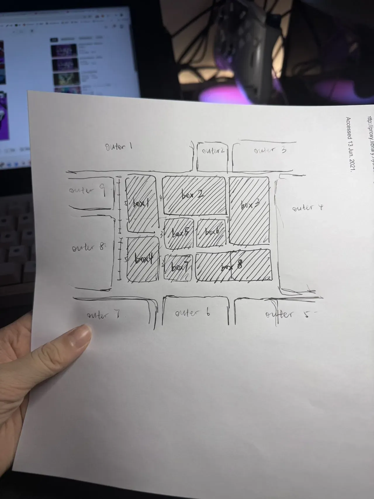
Bento grid:
The.bento-griduses a carefully definedgrid-template-areasto produce a structured but complex layout. Each.containeris assigned to aboxNarea. This gives a patchwork-like feel, reminiscent of dashboards..bento-grid { display: grid; grid-template-areas: 'box1 box2 box2 box3' ... 'box4 box7 box8 box8' 'box4 box7 box8 box8' 'box4 box7 box8 box8'; }
-
Canvas styling:
Each canvas is set towidth:100%; height:100%;andfilter: saturate(0);to ensure the video snapshots appear grayscale. -
Scrolling text:
.scrolling-textpositioned on each edge of the screen, creating a continuous “CHANCE ME!” marquee. This calls attention to the repetitive, almost mocking nature of the experience.
3.2.3. JavaScript Walkthrough
Key Libraries: ml5.js for pose detection, p5.js for capturing and drawing video, gsap for text animations.
Key Classes and Variables:
bodyPoseis the ml5 bodyPose model instance.reportGeneratedtracks if a report is currently shown.VideoCanvasclass encapsulates logic for rendering a cropped portion of the video stream onto a<canvas>element based on a specified keypoint.
class VideoCanvas {
  constructor(canvasId, keypointName) {
    this.canvas = document.getElementById(canvasId);
    this.ctx = this.canvas.getContext('2d');
    this.keypointName = keypointName;
  }

  draw(video, poses) {
    // Finds the specified keypoint and draws a cropped section of the video
  }
}
Setup and Pose Detection:
preload()loads the bodyPose model.setup()initializesVideoCanvasobjects for each keypoint of interest. Each corresponds to acanvasin the bento grid.video = createCapture(VIDEO)starts a live webcam feed.bodyPose.detectStart(video, gotPoses)initiates pose detection. The callbackgotPosesupdates the globalposesarray.
Draw Loop:
- The
draw()function is implicitly called byp5.jsat 60fps. - Each
VideoCanvasincanvasescallsdraw(video, poses)to update the displayed body part snippet. checkRightEye()is called each frame to determine if the right eye is visible. If yes and no report is generated yet,generateRandomReport()is triggered.
Report Generation:
generateRandomReport()picks random fictional data (ethnicities, schools, majors, etc.) from predefined arrays. The arrays contain humorous fake data (e.g., “Shinobi,” “Mandalorian,” “Hogwarts” as nationality).- Uses
gsap.to()for text animations, typing out the randomly selected values character by character. - Once a report is generated,
chance-percentagestarts flickering through random numbers, simulating an unstable “chance” metric.
Key Techniques:
-
Lazy Loading and Performance:
video.elt.setAttribute("loading", "lazy")hints at lazy loading the video element, potentially improving performance.
-
Animation and User Feedback:
gsapis used to animate text, giving a typing-like effect. This makes the data feel dynamically “revealed,” rather than instantly dumped.
-
Separation of Concerns with the
VideoCanvasclass:- By encapsulating cropping/drawing logic in a class, my code is cleaner and each body part’s rendering is easily managed.
-
Flicker Effect for Chance Percentage:
- A simple
setIntervalupdates the “chance” percentage randomly every 99ms. - Short interval updates combined with CSS
@keyframes flickercreates a glitchy, unstable feeling.
- A simple
-
Data from JSON-like arrays:
- Although my code currently contains arrays inline, the logic is structured so it could easily pull from a real JSON file. This design suggests scalability.
-
Fallback Logic:
- If the right eye is not detected (
confidence <= 0.1), the report is cleared, resetting everything, and??is shown in the chance field. This ensures the experience is dynamic and tied to user presence.
- If the right eye is not detected (
4. The Struggle
Aside from learning grid and flexbox layouts, two major challenges stood out:
- Pose detection inaccuracies: When keypoints drift, does the score become too erratic? I needed to add some smoothing but not so much that it lost its sense of absurdity.
You can find a solution for this in the previous code walkthrough. - Generating content for the dynamic report that’s both satirical and believable: Choosing the right text and random logic so the content seems plausible yet clearly deviates from common sense.
More details about this will appear in the following “Audience” section.
Emotional struggles also emerged:
While repeatedly fine-tuning the work’s visual layout, the flickering rate of the scores, and the report’s text, I began to wonder: Am I applying the same thought process to myself—am I rating my own work? This cycle of self-dimensionalization might trap me in an endless pursuit of “perfection.”
5. The Audience
Taste your own reflection, pixel by pixel,
And what still remains.
I invited five people to try it out.
- As viewers approached the camera and saw the flickering score, some deliberately struck odd poses or tried to maintain a “perfect” frontal stance to get a “better” score. This interaction is precisely what the piece aims to satirize: people unconsciously conforming to data metrics.
- Some viewers stared curiously at the unstable score, trying to discern a pattern; others dismissed it as a trivial gimmick.
Feedback and Observations:
- One viewer admitted, “I feel like I’m being judged, but I have no idea what the criteria are.” This is exactly the reaction I sought.
- Another joked, “This thing is triggering my anxiety from a year ago!”—once again confirming the resonance of what the piece tries to convey, though the triggering text needs to be fixed and was fixed later on.
During user testing, I noticed that the initial bento grid layout and the content (which originally reflected the audience’s real-life backgrounds) made some participants distinctly uncomfortable. They reported feeling “broken down” and placed under a lens that was too clear and too fragmented, as if their identities were dissected piece by piece.
This feedback prompted me to make adjustments:
First, I abandoned the realistic mode of text generation. I no longer used factual backgrounds, authentic ethnicities, or realistic activity lists to emphasize the “dimensionalizing” edge. Instead, I turned to completely fictional textual content—such as made-up extracurricular activities and fanciful ethnicities or nationalities.
All these fictional texts are now randomly selected from a pre-written JSON dataset rather than being generated in real-time by a language model (like llama). This approach avoids long loading times and prevents overly specific associations.
Even though the text became absurd and fictional, I maintained the black-and-white visual style. I didn’t rely on bright colors or overt humor to dilute the discomfort. This way, the overall experience still preserves a certain tension and unease, but shifts from direct “factual dissection” to a more subtle, surreal form of “fictional dimensionalization.”
6. Exhibition
I haven’t managed to edit a complete video; I plan to demonstrate it live in class. However, here’s a rough demo:
You can try it out yourself here:
https://n3xta.github.io/fall2024-creative-computing-final/
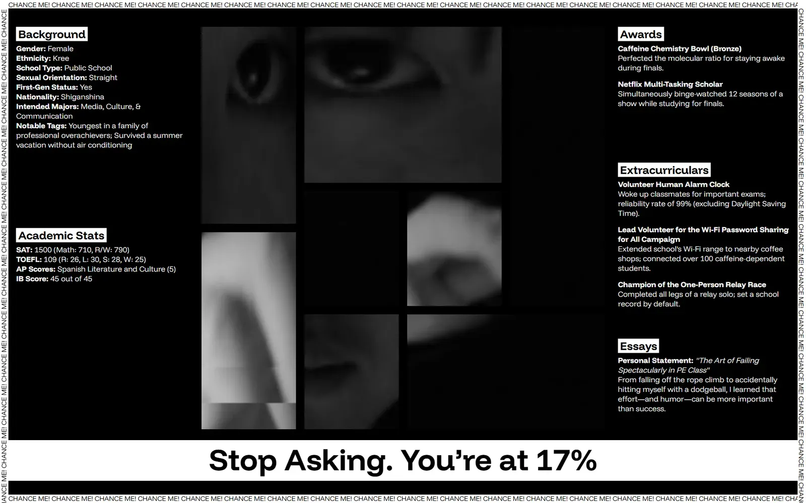
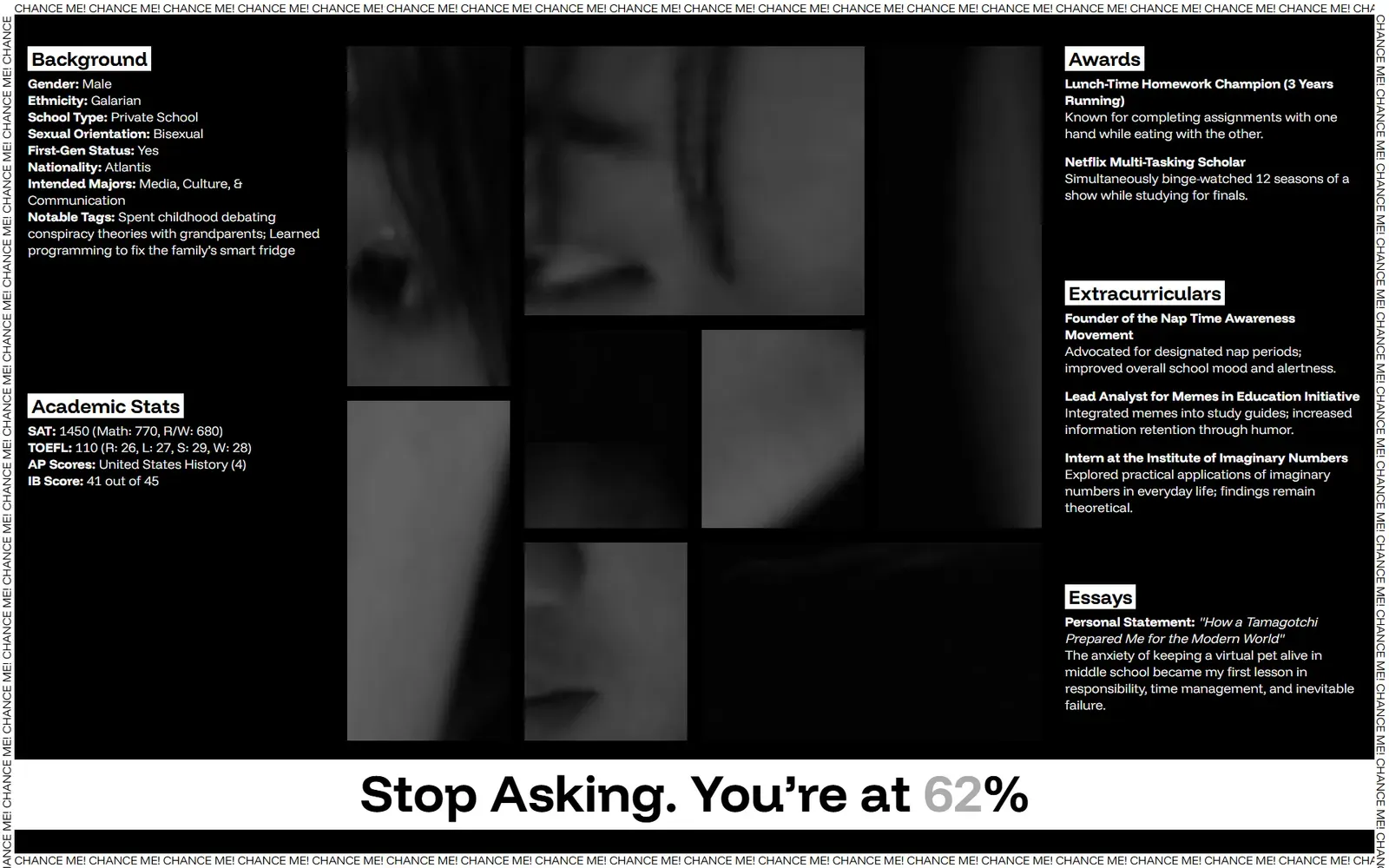
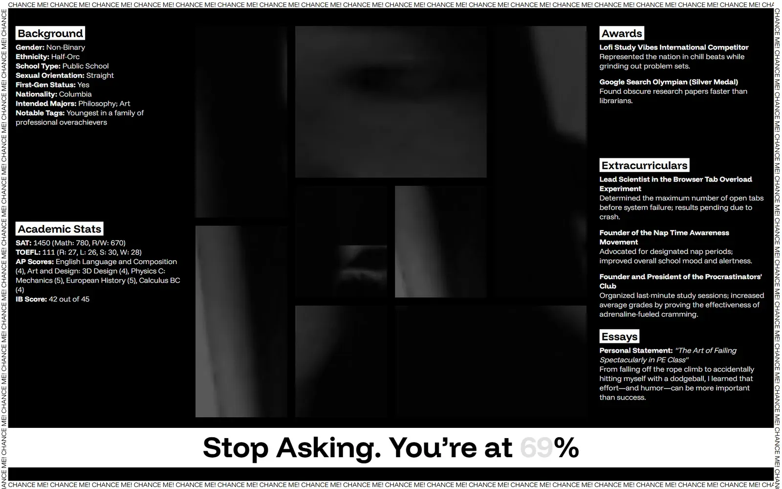
Some screenshots:
7. The Next Step
- Key Question: After completing this piece, what new aspirations do I have for myself and my work?
In future versions, I hope to add more interactive dimensions. For instance, I’d like to integrate AI models to generate textual descriptions of the viewer’s posture, making the report even more random and absurdly readable. Perhaps I could incorporate additional data sources—like how long viewers linger, their mouse trajectories, or even background noise levels—further enriching this “absurd data theater.”
On a technical level, I might experiment with WebGL or shader effects to give the digitization process more visual tension. Artistically, I can apply this logic of “dimensionalization” to different social issues—from education to workplace evaluations and even the “like” mechanisms on social media. Everything can be dissected, amplified, and satirized through data dimensions.
Most importantly, I’d like to leave viewers with some kind of “souvenir.” For instance, if someone stops in front of the piece for five seconds, I could capture a screenshot and generate a QR code, allowing them to download their own “admissions file.” But this would require server-side functionality, which I haven’t set up yet.
Regarding the QR code idea:
I’ve made some attempts, but to continuously capture and generate codes, I’d need a server. So I’m not there yet.
But also check this out. https://youtube.com/shorts/R6IDnkJBJNs?feature=share