Bicycle Bears
Reading response to Frank Chimero, The Web’s Grain
That dial-up tone at the beginning made me burst out laughing, because I only knew it as a sound effect commonly used in meme videos. But once I understood its context, I also felt a sense of nostalgia. I feel a bit guilty that what was once as warm as whiskey to early web users has become a joke for kids today. Starting from this nostalgia, Frank Chimero explores how “edgelessness” has shaped the design and experience of the internet. From David Hockney’s collage photography to the paradox of responsive web design, from technological overreach to the pitfalls of convenience, everything ultimately points to one question: What is technology’s role, and what do we truly want?
The evolution of technology isn’t a straightforward path toward “simplification” or “convergence” but rather a process of continual splitting, recombining, expanding, and collapsing. The edgelessness of the web is reflected not only in its design but also in its impact on people: while we gain convenience, we also surrender autonomy. How do we recalibrate our direction amid the chaos brought by technology? Can we find a form of “elegant technology” that returns it to its proper role? I feel that this is the question the article leaves hanging.
I will select the most thought-provoking sentences from the text and delve into them for a deeper analysis and discussion.
Some reflection on the quotes
I think you make what I call “bicycle bear websites.” Why? Because my response to both is the same.
“Listen bub,” I say, “it is very impressive that you can teach a bear to ride a bicycle, and it is fascinating and novel. But perhaps it’s cruel? Because that’s not what bears are supposed to do. And look, pal, that bear will never actually be good at riding a bicycle.”
Are we all creating “bicycle-riding bears”?
In 2015, the author criticized a certain trend of excessive design that went against the fundamental nature of the web, for example:
- Complex interactive animations that slow down website loading and hurt user experience.
- Counterintuitive navigation that leaves users lost in all the “cool” effects.
- Heavy JS frameworks that lead to poor web performance, causing lag even on high-end devices.
Ten years later, has it gotten any better? It might have gotten worse. Design tools have become more powerful: WebGL, Three.js, GSAP, Next.js, TailwindCSS, and so on now make it easy to create extremely complex visual effects, even full 3D immersive experiences. Hardware capabilities have also vastly improved: by 2025, GPU-accelerated web rendering has long been the norm, and front-end libraries have been optimized to make complex animations run more smoothly than they did in 2015. But the question remains—does any of this actually help? Algorithm-driven web experiences are on the rise: more and more websites are no longer designed by humans but generated by AI or even dynamically adjusted to match the user. Do these “intelligent” features really honor the essence of the web, or do they make it more fragile?
In other words, websites today may be even more likely to become “bicycle-riding bears.” They can do more impressive tricks, but should they really be doing them?
I’ve collected many artists’ personal websites—not because they’re flashy. For instance, one of my favorite command-line animators has a homepage that doesn’t rely on any of these fancy libraries:
I love this type of design. I specifically joined this creator’s Discord to ask how he built the site and his command-line animations:

He answered:
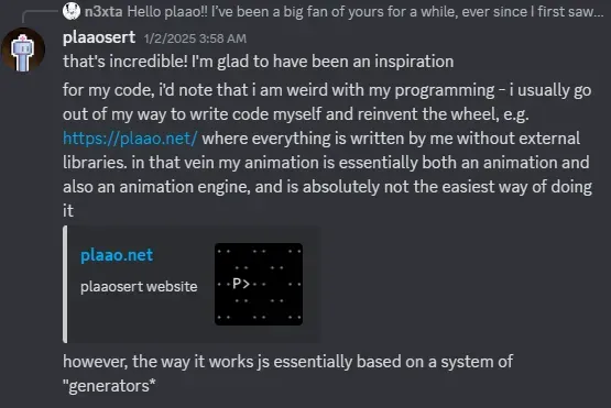
Clearly, he’s someone who loves “making his own wheels.” Speaking of reinventing the wheel—are you seeking efficiency, or are you seeking control? In 2025, when code can be generated by AI, do you still want to reinvent the wheel?
I recently shared some thoughts on my blog. I feel that programming education in the age of AI will be completely different from how it is now. Going from luxury to simplicity is hard. In the future, students will likely struggle to learn programming in the same detailed way we did—checking each line for syntax, carefully designing data structures, building up from the most granular steps to see the bigger architectural picture.
For web development, “reinventing the wheel” means customizing, breaking free from cookie-cutter templates. I want to do creative work, not just piece together UI components. And to use the “bicycle bear” metaphor from another angle: “unnecessary bloat.” From that perspective, reinventing the wheel can also mean being lightweight, avoiding needless bulk. If you make your own wheel, you can write only the functionality you need, reducing code bloat. You can take complete control of optimization strategies instead of relying on a framework’s “default” settings. It makes your code cleaner and lighter.
But as a beginner, reinventing the wheel comes with a price. If you do it just for the sake of doing it, you might spend a lot of time re-implementing existing solutions. Often, when I search how to implement a feature, I discover that Tailwind or React or Next.js could handle it right out of the box. And for someone still learning, that homemade wheel might not actually perform better than a mature, optimized library.
I’m digressing. Back to the article. In 2025, front-end development is dominated by “powerful frameworks and computing resources,” yet a website is still a website. I resonate with the author’s viewpoint, which I think boils down to:
- A website’s purpose is to convey information, not to show off technical gimmicks.
- A website should be lightweight and structured, not a heavy 3D CG scene.
- A website’s intrinsic features should be leveraged, not defied.
I placed the “bicycle bear” analogy at the very beginning because I think it captures “the web’s grain” so brilliantly.
If you’ve ever designed a responsive website, this is the source of all your sadness. This is the fount of your tears, the wellspring of your suffering. If you believe in the afterlife, this is the circle of hell where they light the soles of your feet on fire.
The pain of responsive web design. When I saw this, my first instinct was to check when Tailwind was created—indeed, it was about four years after the article was written.
My first thought is that Tailwind might alleviate some of the author’s frustrations. It does reduce chaos and makes UI components more reusable, but it also makes every website feel like a product off the same assembly line. If the 2015 problem was “going against the nature of the web by forcefully adding complex interactions,” then the 2025 problem might be “excessive uniformity, undermining the free-form nature of the web.” Is every site supposed to follow the same design language? The author wouldn’t like that. That brings us to David Hockney.
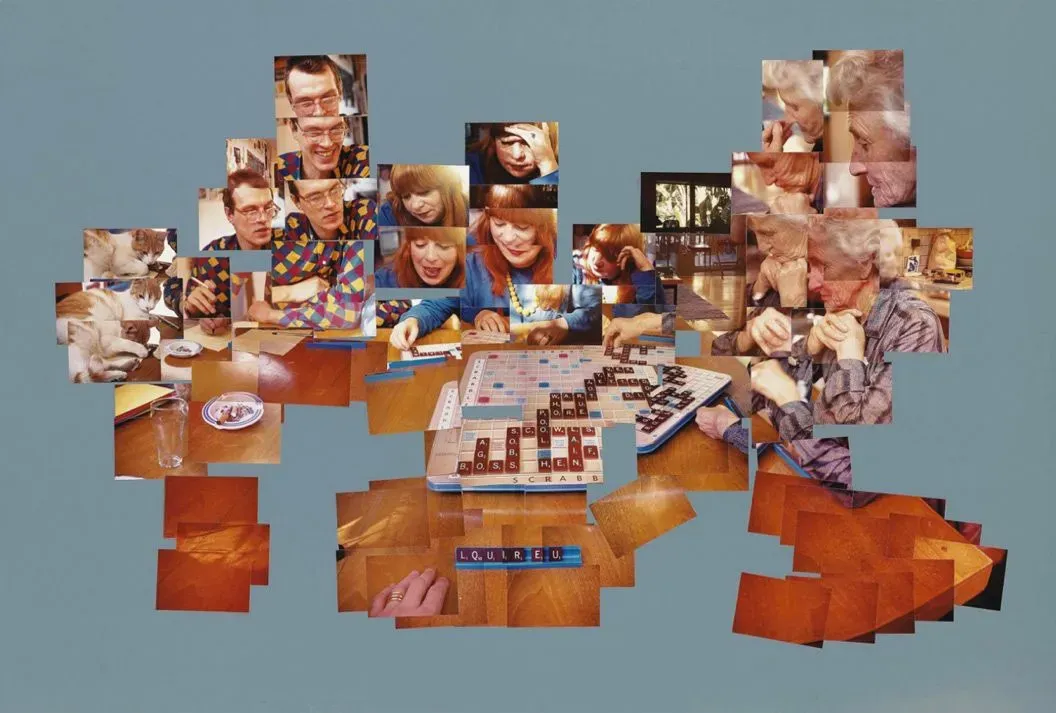
Hockney began with an image-making practice that relied on the grid necessitated by the Polaroids’ borders and produced a rectangular final work. When he switched to normal film, he was able to overlay images in any necessary shape that accurately described the time and space of a scene. Nobody would set out to make a picture with these edges—what you see is what was required by the images he managed to snap.
Before reading this article, my impression of David Hockney was limited to his swimming-pool paintings. In fact, if you Google him, you’ll mostly see his pool artworks:
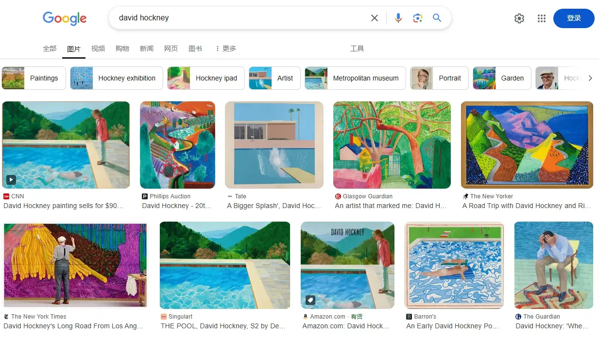
It never struck a chord with me, and so I never delved deeper into his work and missed out on so much. I really like the example from this article, so I have to share his The Scrabble Game here for context:
If we compare web design to photography:
Traditional web design = classic photography. Older websites often used a fixed layout, like a single snapshot in photography. Every element was placed in a predetermined framework and wouldn’t adapt to user environments. The problem was that this layout couldn’t adapt to different screens (large, mobile, tablet) and once the environment changed, the user experience broke.
Responsive web design = Hockney’s collage photography. Responsive design emphasizes flexibility. It doesn’t strive for a single, fixed “perfect composition” but ensures the content can dynamically assemble itself, adapting freely to different screen sizes. Each UI component is like a separate photo—by itself, maybe incomplete, but when put together they form a coherent whole.
Different devices = different viewing angles. Your site looks one way on a phone, another way on a desktop, yet users still understand it’s the same “site.” Hockney’s photo collages are similarly pieced together, but viewers can still perceive the complete scene.
It’s ingenious!
And the shift in Hockney’s photography reflects the evolution of web design. Hockney’s collage photography underwent two phases. First came the Polaroid grid. Because of Polaroid’s limitations, each photo was the same size, and the final piece was strictly aligned to a grid. This is akin to the early days of web design, where developers commonly used fixed-pixel layouts and everything was placed within an exact grid. The second phase involved freeform photo overlays. He switched to traditional film, free from grid constraints, letting the final shape of the artwork be defined by the photos themselves, not by a preset framework. This is like responsive design where content is no longer confined to fixed containers but adapts itself to the screen, forming a naturally fluid structure.
I’m reminded of this meme:
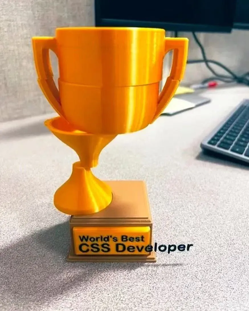
I love the freedom implied by that meme: elements can freely combine, and across different devices and different environments, the complete information is still displayed. Like Hockney shaking off the constraints of a rectangular canvas, a website shouldn’t be locked into fixed layouts—it should be dynamic, modular, and adaptable to different environments. “The flow of information.”
Up to a point, swapping autonomy for ease is a pretty good trade: who wants to run the math on their accounting books or call the restaurant to place a delivery order? But if taken too far, convenience becomes a Trojan Horse. We cede too much control and become dependent on something we can no longer steer. Platforms that promised to bring convenience to a process or intimacy to a relationship now wedge themselves into the transaction as new middlemen. Then, we’re left to trust in the benevolence of those who have the power to mold our dependencies. Citing a lot of the concerns I mentioned earlier, those people are less responsible and compassionate than we had hoped. In pursuit of convenience, we have opened the door to unscrupulous influence.
I’m sorry to have to bring large language models into this. It perfectly illustrates how AI can disrupt our lives. When we use “more convenient” products, we often overlook one thing: they don’t actually eliminate complexity; they just hide it.
For example: Ordering takeout by phone is inconvenient → outsource to a service like DoorDash. Driving and looking for directions is inconvenient → outsource to a navigation app. Time management is inconvenient → outsource to an AI calendar assistant.
But here’s the issue: if these systems fail, can we revert to “manual mode”?
If you don’t use Google Maps, do you still know the way home? If you don’t use AI to summarize articles, are you willing to read them yourself? If you don’t use AI translation, can you still comprehend foreign languages?
Once you’ve delegated enough, you find you’ve lost direct control over your own life, relying instead on these platforms to “mediate” your interaction with the world.
And now the new middleman isn’t just these corporations but a single AI agent. I’m really not sure why so many people are keen to push the idea of AI “agents.” Once that “only option” is controlled by a handful of monopolies, if one day we want to regain control of our own lives, will we be able to?
I won’t ask for peace, quiet, ease, magic or any other token that technology can’t provide—I’ve abandoned those empty promises. My wish is simple: I desire a technology of grace, one that lives well within its role.